I am writing this from a quiet corner of a gallery in Mayfair, where a single canvas of deep Prussian blue hangs against a wall of raw, unpainted plaster. There is no competition here, no visual noise; only the conversation between one considered colour and the honest texture of the surface it inhabits. It is, in its simplicity, a masterclass in what I have spent the better part of two decades trying to articulate to clients, developers, and anyone who will listen: that a curated colour palette is not a decorative afterthought. It is the foundational grammar of a sophisticated interior. The choices you make with colour, the restraint you exercise, and the relationships you cultivate between tones are what separate a room that merely looks expensive from one that genuinely feels intelligent. This is the art of chromatic discipline, and it is, I believe, one of the most underestimated skills in the entire canon of luxury design.
Colour, in the hands of the undisciplined, becomes noise. In the hands of someone who truly understands its weight, its temperature, and its capacity to alter the perceived geometry of a room, it becomes architecture. I have walked through penthouses in Dubai where every surface screamed for attention, and I have stood in modest Parisian apartments where a single, perfectly chosen shade of warm grey made the entire space feel like a Balenciaga coat: effortless, considered, and quietly devastating. The difference was never budget. The difference was always intention.
The Philosophy of Chromatic Restraint in Luxury Interiors
Why Less Is Always More Considered
The most common mistake I encounter, whether I am consulting on a private residence in Kensington or a corporate headquarters in the City, is the belief that a curated colour palette means choosing many colours carefully. It does not. True chromatic discipline means choosing fewer colours with absolute conviction. The edit is everything. When you reduce your palette to two or three anchoring tones and allow them to breathe across surfaces, textiles, and architectural details, you create a visual coherence that no amount of trend-chasing can replicate. Think of the great couture houses: their power lies not in variety but in signature. A room should have a signature, a chromatic identity that is immediately legible and deeply felt.
The Emotional Architecture of Tone
Every colour carries an emotional frequency, and understanding this is the difference between decorating and designing. Warm ochres and aged terracottas speak of earth, of permanence, of a life rooted in something real. Cool slate blues and soft sage greens carry the quality of distance, of contemplation, of rooms that invite you to think rather than perform. When I am developing a curated colour palette for a client, I am not simply selecting shades from a fan deck; I am composing an emotional score for the space. I am asking: what should this room make you feel at seven in the morning, and how should that feeling shift by candlelight at ten in the evening? Colour is not static. It is a living, breathing element that responds to light, to season, and to the human body moving through it.
Material Intelligence and the Curated Colour Palette
When Colour Lives in Texture
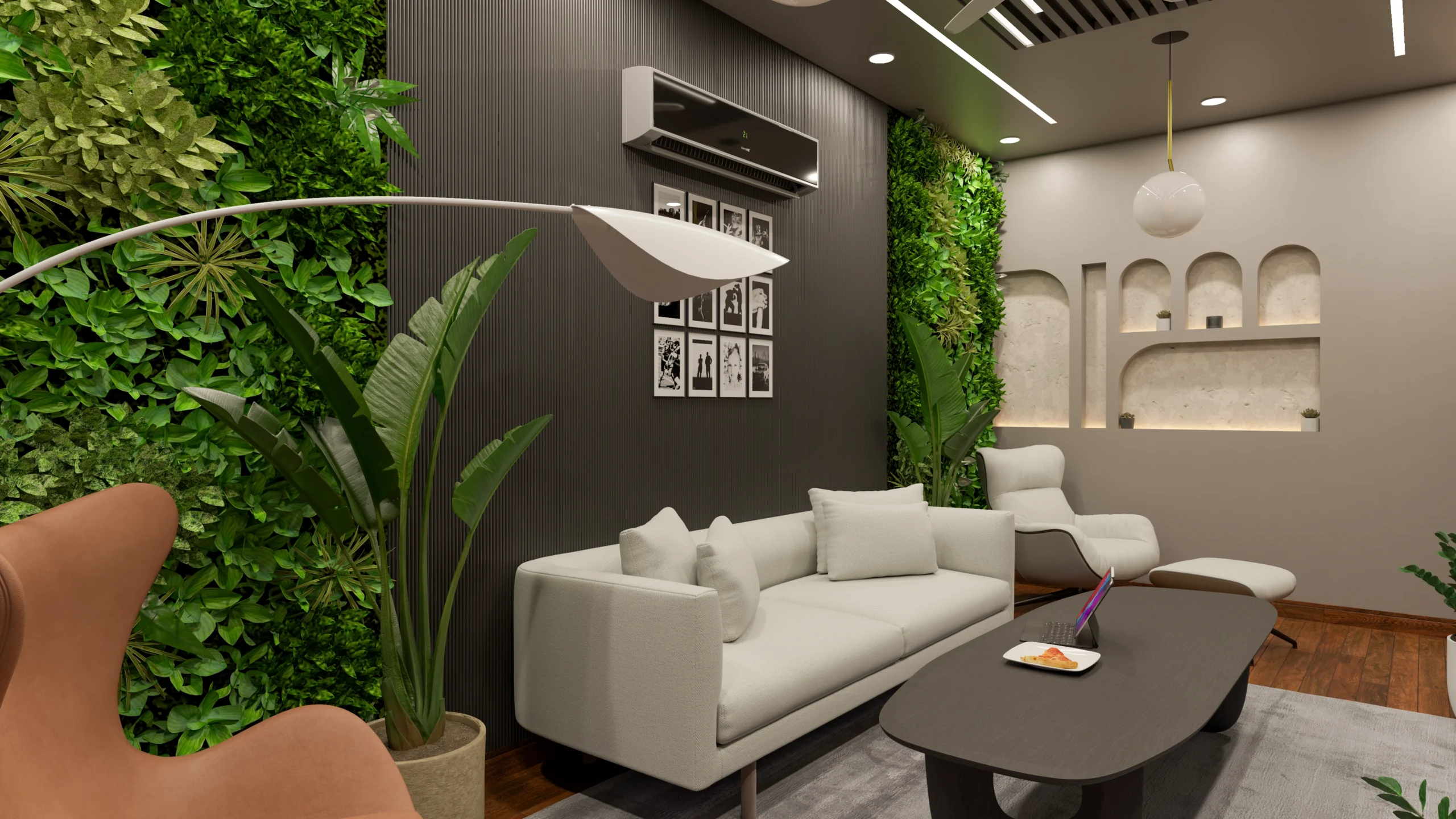
One of the most sophisticated truths in interior design is that the most powerful colour in a room is often not applied at all; it is inherent. The warm amber of aged leather, the cool silver-green of honed Calacatta marble, the deep, almost black richness of oiled walnut: these are colours that carry history within them, and they are infinitely more complex than anything that comes from a paint tin. When I speak of a curated colour palette, I am always speaking of the full material landscape of a room, not merely its painted surfaces. The aged leather of a reading chair contributes as much to the chromatic narrative as the wall behind it, and the two must be in conversation. This is what I mean by material intelligence: the understanding that colour and texture are inseparable, that one without the other is merely decoration, while together they constitute genuine design.
The Role of Natural Light as a Chromatic Variable
No curated colour palette can be considered in isolation from the quality of light that will inhabit the space. A shade of warm ivory that sings in the north-facing drawing room of a Georgian townhouse will turn flat and lifeless in a south-facing apartment flooded with afternoon sun. I always advise clients to live with large paint samples for a minimum of a week, observing them at dawn, at midday, and under artificial light in the evening. The colour you choose is not the colour on the card; it is the colour as transformed by your specific light, your specific orientation, and the particular quality of the sky above your city. In London, that sky is often a soft, diffused silver, and it is one of the reasons our interiors have historically favoured such nuanced, complex tones: the dusty pinks, the warm greiges, the deep forest greens that absorb and reflect that particular northern light with such extraordinary grace.
Constructing Harmony: The Rules of Chromatic Composition
The Anchor, the Accent, and the Whisper
When I am building a curated colour palette from the ground up, I work with a three-tier structure that I have refined over years of practice. The first tier is the anchor: a dominant tone that establishes the emotional register of the space and typically occupies the largest surface areas, the walls, the primary flooring, the main upholstery. The second tier is the accent: a complementary or contrasting tone that appears in secondary elements, a pair of armchairs, a set of curtains, a lacquered cabinet. The third tier, and the one most often neglected, is what I call the whisper: a barely-there tone that appears in the smallest details, the trim of a cushion, the binding of a book left on a coffee table, the patina of a bronze handle. It is the whisper that gives a palette its depth and its sense of having been lived in rather than installed.
The Danger of the Trend-Driven Palette
Every year, the colour forecasting industry produces its pronouncements, and every year, a wave of interiors appears wearing the same shade of whatever has been declared the colour of the season. I understand the appeal; there is comfort in consensus, and there is a certain social currency in being current. But a curated colour palette built on trend is a palette with an expiration date, and in the context of a high-end interior, that is a fundamental contradiction. The spaces I most admire, the ones that appear in my memory years after I have visited them, are invariably those that feel entirely outside of time. They are not of this year or last year; they are simply, and completely, themselves. That quality of timelessness is only achievable when colour choices are made in service of the space and its inhabitants, not in service of a forecast.
The Elena Edit: Chromatic Dictates for the Considered Interior
Principles That Govern Every Palette We Build
At The Shape Interiors, every project begins with a chromatic brief, a document that establishes the emotional intention of the space before a single material is selected. These are the non-negotiable principles that govern that process, distilled into what I call The Elena Edit for colour.
- Commit to an anchor tone first: Establish the dominant emotional register of the space before introducing any secondary colours. The anchor should account for at least sixty percent of the visual field.
- Honour the material palette: Treat the inherent colours of your raw materials, marble, timber, leather, aged metal, as primary chromatic contributors, not as neutral backgrounds.
- Test colour in situ and over time: Never select a paint colour from a small chip under artificial light. Live with large samples across a full week of natural light cycles.
- Limit your palette to three intentional tones: Anchor, accent, and whisper. Every additional colour introduced beyond this structure requires a compelling justification.
- Resist the trend cycle: Ask whether a colour choice will feel as considered in ten years as it does today. If the answer is uncertain, reconsider.
- Consider the chromatic journey: Think about how colour transitions from room to room, ensuring a sense of narrative continuity rather than a series of disconnected statements.
- Let darkness work for you: Deep, saturated tones in the right context, a library, a dining room, a private study, create an intimacy and gravitas that no pale shade can replicate.
The Quiet Power of a Monochromatic Register
There is a particular kind of courage required to commit to a monochromatic palette, to build an entire interior around the infinite variations of a single hue. It is a discipline that demands an acute sensitivity to texture and finish, because when colour variation is removed, every other quality of a surface becomes magnified. The difference between a matte plaster wall and a satin-painted surface in the same tone becomes a conversation of extraordinary subtlety. The way a velvet cushion absorbs light differently from a linen throw in the same family of grey becomes the entire visual interest of a room. This is chromatic discipline at its most rigorous, and when it is executed with genuine mastery, the result is a space of almost meditative calm, a room that asks nothing of you except that you be present within it.
Colour, at its most disciplined, is an act of profound generosity. It is the designer’s gift to the person who will inhabit the space: a carefully composed environment that supports their life, elevates their daily rituals, and asks them, quietly and consistently, to be their best selves. I think often about the Mayfair gallery and that single canvas of Prussian blue, and I think about what it means to make one choice with absolute conviction and then have the restraint to make no other. There is a lesson in that for every room we will ever design, and perhaps for every life we will ever live. What colour, I find myself wondering, would you choose if you could only choose one, and what would that choice reveal about the interior life you are trying to build?
The architecture of your legacy is defined not merely by the objects you choose, but by the standard of life you refuse to compromise on. At The Shape Interiors, we specialise in the silent language of luxury, transforming raw space into sophisticated environments that resonate with the human spirit and professional excellence. Whether you are defining a private sanctuary or a global corporate headquarters, the requirement remains the same: a vision executed with absolute precision.
We invite you to explore our work and discover why the world’s most discerning individuals trust us with their most personal and professional environments.
Refine Your World.
Your journey toward an unparalleled environment begins with a single conversation. Connect with our global design team to initiate your bespoke project.