
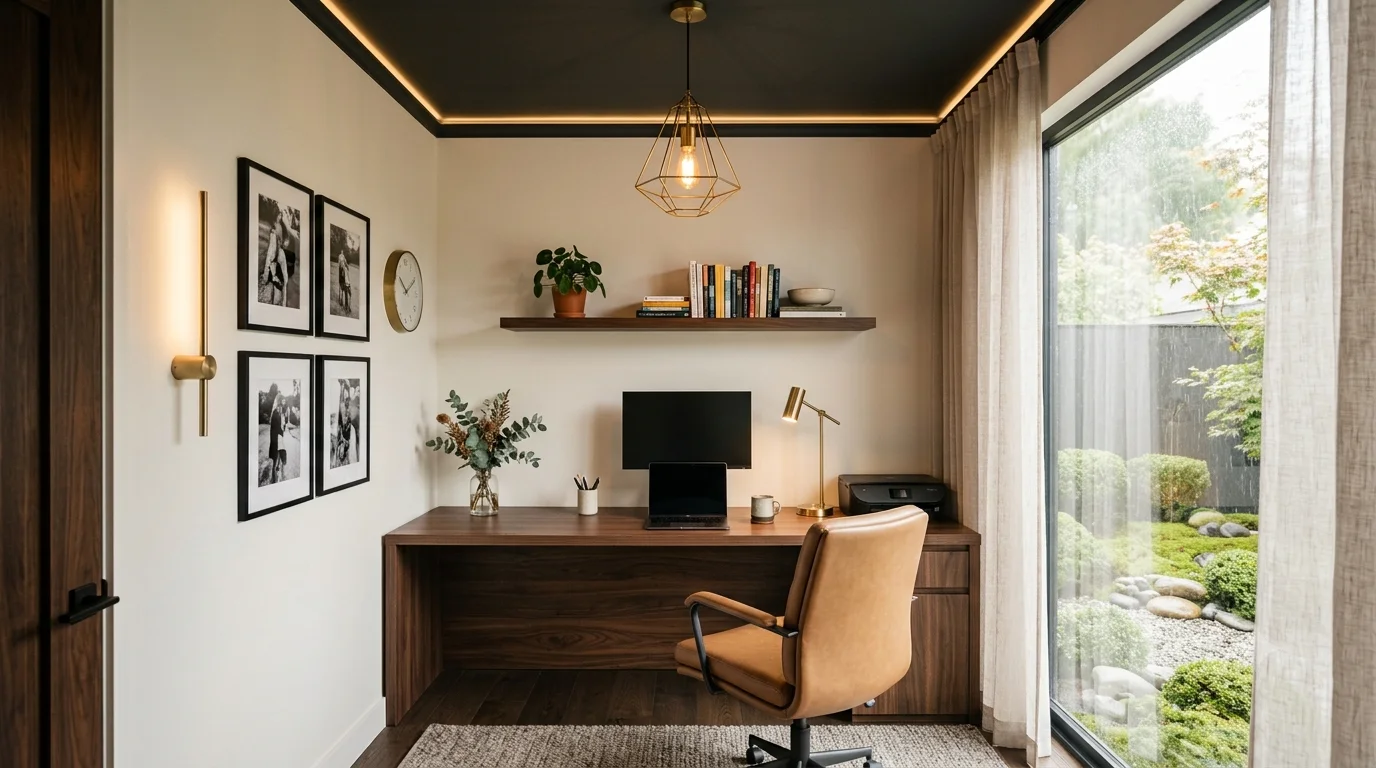
The storeroom that used to hold suitcases and old furniture is now your office. The door closes at nine and you are supposed to focus for the next eight hours. You stand there holding two paint swatches and neither one feels right. This is the exact moment most people search for the best color palette for a home office, hoping one universal answer exists. It does not exist, and that is actually good news, because it means you can build the right palette around your specific work and your specific room.
The most useful place to start is not a color at all. A professional color and lighting consultation looks at your profession, your lighting, and your room shape together. Treating color as an isolated decision is where most home office paint jobs go wrong. Two people can convert an identical storeroom and still need two completely different palettes, simply because one edits photographs for a living and the other spends the day on client calls. Generic color guides tend to ignore that difference completely.
Why Color Alone Never Decides How a Home Office Feels
People often discuss color theory as if a single shade can fix focus, mood, and comfort on its own. Color is really one variable inside a larger system that includes lighting, room size, materials, and the nature of the work itself. A blue wall in a sunlit room with wide windows behaves nothing like the same blue wall in a windowless storeroom lit by one bulb. Before you choose a palette, you need to understand how color actually affects the brain, and why identical colors can produce different results in different spaces.
The Psychological Effect of Color on Focus and Mood
Environmental psychology research generally links color to shifts in arousal and mood, though the effect stays moderate rather than absolute. Color cannot override poor lighting, clutter, noise, or an uncomfortable chair. What it does is nudge your baseline mood in a consistent direction across long working hours. These general tendencies give you a starting point before you personalize a palette for your own role.
Warm Tones: Reds, Oranges, and Warm Yellows
Some workplace studies link warm colors to alertness and energy, which is why they show up often in creative and social spaces. Used at full strength across every wall, they can tire your eyes during long screen-based sessions. Used as accents rather than the dominant tone, they keep a room feeling active without overwhelming it. They suit short bursts of high energy work more than long stretches of quiet concentration.
Cool Tones: Blues, Greens, and Teals
Researchers frequently connect cool tones to calm and steadiness, and several workplace surveys report lower stress in blue-toned or green-toned rooms than in bright red rooms. Blue in particular tends to support sustained mental focus over many hours. Green carries a similar calming effect while reading as more natural and less clinical. Both work well as a dominant wall color for long, detail-heavy tasks.
Neutral Tones: Beige, Grey, White, and Taupe
Professional settings favor neutrals because they read as calm without pulling attention toward themselves. A warm neutral avoids the coldness that plain white can create under artificial light. Neutrals also age well, since they rarely feel dated the way a trend color can within a few years. They work particularly well as a base you can layer other colors, furniture, and lighting onto.
Saturation and Intensity
A highly saturated color, even a calming one like green, can tire you in large doses because it constantly demands visual attention. A muted or softened version of the same hue keeps the psychological benefit while reducing fatigue over an eight hour workday. Designers often choose a softened sage over a bright kelly green for exactly this reason. Saturation, more than the color family itself, usually separates a restful room from a tiring one.
Contrast and Visual Weight
Too little contrast between your wall color and your furniture can make a room feel flat. Too much contrast near the screen area can increase eye strain during long working hours. A balanced approach keeps moderate contrast between the wall behind the monitor and the wall you rarely look at. This detail often gets missed because it depends on furniture placement, not paint choice alone. Getting this balance right usually takes a physical walk-through of the room rather than a decision made purely from a paint chart.
Why the Same Color Can Feel Different in Two Rooms
Two rooms painted the exact same shade of blue can feel completely different once you add furniture, light, and finish. This is one of the most common reasons people repaint a home office within a year of finishing it. The color itself did not fail, but the surrounding conditions changed how you perceived it. Recognizing these variables before you paint saves both money and disappointment.
Room Size and Proportion
In a small converted storeroom, dark or saturated colors can make the walls feel closer, which some people find cozy and others find confining. In a larger room, the same color often reads as rich rather than tight. Ceiling height changes this further, since a low ceiling with a dark wall color can feel more compressed than a low ceiling with a lighter tone.
Furniture Material and Finish
Wood furniture with warm undertones shifts a cool grey wall slightly warmer in perception, while black metal furniture sharpens the same grey and makes it feel more clinical. Fabric chairs soften a room’s overall tone, while glass and glossy surfaces bounce more light and color around than matte ones. This is why a swatch on the wall never fully predicts the finished room.
Wall Finish: Matte versus Glossy
A matte finish absorbs more light and shows color as a flatter, calmer tone, which most people prefer for long focus sessions. A glossy or semi gloss finish reflects more light and can intensify both the color and any glare from a screen or window. For most home offices, choose a matte or eggshell finish for the more comfortable working experience.
Existing Architectural Elements
A room with visible wood beams, exposed brick, or an odd alcove already carries its own color and texture. That texture will interact with whatever new color you add. Ignoring these elements often leads to a palette that looks correct on a paint chart but clashes once applied. A converted storeroom in particular often has awkward proportions that a generic palette guide never accounts for.
The Direction the Desk Faces
You see the wall behind the monitor constantly in your peripheral vision, while you barely notice the wall behind your seating during work. This means the same room can carry two different color strategies: a calmer tone facing the desk and a slightly bolder tone behind the seating. Generic advice about home office colors frequently overlooks this detail.
How Lighting Changes the Way a Color Palette Performs
Color is not an independent factor for productivity or comfort. It works in partnership with lighting, and the same palette can feel completely different depending on how much and what kind of light reaches it. A grey that looks sophisticated under warm afternoon sun can look flat and lifeless under a single cool white bulb at night. This is the single most overlooked factor in home office color planning, and it deserves as much attention as the color choice itself.
Rooms With Natural Light versus Rooms Without It
Many home offices come from spare rooms, storerooms, or corners that were never designed with daylight in mind. The amount and direction of natural light a room receives changes which colors will look balanced rather than washed out or overly dark. This matters especially if you are converting a windowless storeroom, since the palette rules for that room differ meaningfully from a room with a large window.
North Facing Rooms
Rooms facing north tend to receive cooler, more even light throughout the day with fewer harsh shadows. Cool colors can occasionally feel a touch flat in this light. A warm neutral or a softly warmed grey often balances the room better. Professional consultants commonly make this adjustment, though generic color charts rarely account for it.
South Facing Rooms
South facing rooms typically receive warmer, stronger, and more direct light for longer stretches of the day. Cooler colors handle this warmth well and prevent the room from feeling overly warm or visually loud by midday. Bright white trims can also help control glare in these rooms without dulling the wall color.
Windowless Storerooms Converted to Offices
A room with no natural light source depends entirely on artificial lighting to reveal color accurately. The wrong bulb temperature can distort even a well-chosen shade. Very dark or heavily saturated colors carry more risk here, since they can make an already enclosed room feel smaller. A lighter neutral base with one confident accent wall performs more reliably in these spaces.
Rooms With Limited Daylight Hours
Some rooms get natural light for only a few hours a day. The palette needs to work well in both daylight and evening artificial light. Test a paint sample at different times of day, not just once, since this is the only reliable way to judge the color. Many repainting regrets come from choosing a color based on a single midday glance.
Artificial Light as the Sole Source
When artificial light does all the work, the color temperature of the bulb matters as much as the paint color itself. A warm bulb over a cool grey wall can create a slightly muddy, undefined tone rather than the clean look you intended. Matching bulb temperature to wall undertone is a detail that is easy to get wrong without guidance.
What Happens as Lighting Layers Are Added
Beyond natural versus artificial light, the number of lighting layers in a room changes how any chosen color performs throughout the day. Most home offices rely on a single ceiling light, which rarely supports both good color rendering and comfortable working conditions. Adding layers is not about decoration alone. It directly changes how accurately and comfortably a color palette reads.
A Single Overhead Light Only
One central light source creates uneven brightness across the room. The desk area often ends up either too bright or left in shadow, depending on its position. Colors under this setup can look inconsistent from one side of the room to the other. This is the most common lighting mistake in converted home offices, and it is often the real reason a chosen color feels wrong.
Ambiance Lighting Only
A room lit only for mood, such as a warm floor lamp with no task-specific light, tends to feel comfortable but can leave the actual work surface underlit. Colors will look pleasant to sit in but may not support the sharp visual focus long screen work needs. This setup suits short creative or reading tasks more than long analytical sessions.
Task Lighting Plus Ambiance Lighting
Adding a focused desk lamp alongside ambient lighting is where most home offices start to feel genuinely functional. The desk area gets the brightness it needs for detail work, while the ambient layer keeps the rest of the room from feeling stark. At this stage, the wall color begins to read closer to how it looked on the original paint sample.
Task, Ambiance, and Decorative Lighting Together
This is the most complete setup. Task lighting supports the work surface, ambient lighting fills the room evenly, and a decorative element such as a warm accent light adds depth without affecting glare on the screen. Colors under this three layer approach feel the most balanced and closest to their true tone throughout the day and evening. Professional interior consultants generally recommend this setup once a room becomes a serious, long-term workspace. It is also the setup most likely to make a chosen color look consistent whether it is nine in the morning or nine at night.
Color Palettes for Creative and Visual Professionals
Different professions place different demands on a room, so the ideal palette rarely stays the same across roles. Someone editing color-accurate photographs needs a very different wall backdrop than someone taking finance calls all day. This section covers the professions most affected by color choice, since their work directly involves visual judgment, screens, or being on camera.
Designers and Visual Creators
Professionals whose work depends on precise visual judgment stay the most sensitive to wall color, since a strongly colored wall behind or beside a monitor can subtly shift how they perceive on-screen colors. For these roles, aim for a neutral backdrop that supports accurate perception rather than a bold statement wall. The breakdown below covers the most common visual professions and what tends to work for each.
Graphic Designers
Choose a neutral grey, closer to mid-tone than very light or very dark, near the monitor, since this reduces the chance of color cast affecting design work. Warm accent pieces elsewhere in the room can still express personality without interfering with the work zone. Consistent, high quality lighting matters here as much as the wall color itself.
Studio Photographers
A neutral grey or muted tone again works as the safer backdrop, especially in any area used for editing rather than shooting. If part of the room doubles as a shooting space, a plain, non-reflective wall in a neutral tone avoids unwanted color bounce onto subjects. Editing corners need consistent, color-accurate lighting more than any single wall color choice.
Video Editors and YouTubers
Editors need the same neutral, low-glare backdrop as photographers, since color grading requires an undistorted reference environment. If you also appear on camera, a slightly warmer neutral behind you can look more flattering than a stark grey, while your editing desk stays neutral. Separating the on-camera backdrop from the editing wall, where the room allows it, solves both needs at once.
Architects and Interior Designers
This profession tends to favor calm, sophisticated neutrals with one confident accent, since the room itself often serves as a portfolio piece for clients during video calls. Soft greys, warm taupes, or muted greens photograph and film well without distracting from work displayed on screen. Lighting that renders true color accurately matters more here than in almost any other profession.
UI/UX Designers
Similar to graphic designers, a neutral or very softly cool backdrop supports accurate perception of interface colors during long design sessions. Because this role involves extended screen time, choose a matte wall finish to reduce glare. A calm, low saturation palette reduces visual fatigue across long sprints of screen-based work.
Content and Media Professionals
Professionals who appear frequently on camera or manage high volumes of digital content have slightly different needs than pure visual creators, since an audience sees their backdrop, not just their own internal work. Personality and brand consistency can matter as much as neutrality for these roles. A look through past projects shows how differently a creative space can look once you factor in profession, camera presence, and lighting together, rather than just picking a trending color.
Streamers and On-Camera Content Creators
Choose a backdrop color for streaming that complements skin tone on camera and avoids colors that clash with common overlay graphics, which often use green, blue, or purple. A muted, slightly desaturated accent wall behind the camera position looks more professional on stream than a bright, saturated one. Consistent lighting temperature matters here, since color shifts noticeably between daylight and artificial streaming light if you do not control it.
Podcasters
Since podcasting stays largely audio-first, wall color carries more freedom here than in video-heavy roles, though many podcasters now record video alongside audio. A warm, comfortable neutral supports long recording sessions without visual fatigue. If video forms part of your setup, the same on-camera considerations as streamers apply.
Social Media Managers
This role often involves rapid task switching between platforms, messages, and content review. A calm, low-stimulation backdrop supports this better than a bold one. Many social media managers favor soft blues or muted greens to support sustained attention across many short tasks. A tidy, uncluttered visual field matters as much as the color itself for this kind of fragmented workday.
Digital Marketers
Marketers frequently move between analytical work, like reviewing campaign data, and creative work, like reviewing ad copy or visuals. A neutral base with a small creative accent area supports both modes better than one dominant bold color across the whole room.
Color Palettes for Business, Analytical, and Technical Professionals
Professions built around sustained concentration, numbers, code, or client trust generally respond well to calmer, more controlled palettes than creative-facing roles. In these rooms, you usually want to reduce visual noise so the mind has fewer distractions during long analytical stretches. This section covers business, technical, and analytical professions, where the palette priorities shift noticeably from the creative roles above.
Finance, Law, Consulting, and Entrepreneurship
Roles built on trust, precision, and client-facing communication tend to favor palettes that read as calm, credible, and understated rather than expressive. These professions also frequently involve video calls, where the wall behind the person becomes part of how clients perceive them professionally. The breakdown below reflects how these considerations shift by specific role.
Finance Professionals and Accountants
Cool, muted blues and greys work well for finance-related roles, since these tones connect to steadiness and careful judgment. Long hours reviewing figures benefit from a low-saturation, non-distracting wall color near the desk. A tidy, uncluttered neutral backdrop supports both focus and a professional appearance on client calls.
Consultants
A neutral palette, often a warm grey or soft taupe, suits consultants well because it reads as credible without appearing cold or corporate. Since consultants regularly present ideas over video calls, the wall visible on camera should feel calm and considered rather than busy. A single tasteful accent, such as a bookshelf or artwork, adds character without undermining the neutral base.
Lawyers
Deep, muted tones such as navy, forest green, or charcoal often suit legal professionals, since these colors read as serious and established when you balance them with good lighting. These tones need strong, layered lighting to avoid feeling heavy or dim in a home setting. A lighter neutral ceiling and trim keep a deep wall color from overwhelming a smaller room.
Entrepreneurs and Founders
Because entrepreneurs often shift between strategic thinking, creative problem solving, and client-facing calls, choose a versatile neutral base with room for a bold, easily changeable accent. This allows your space to evolve as the business and its needs change, without requiring a full repaint. Many entrepreneurs favor confidence-building accent colors such as a muted terracotta or deep green.
Business Analysts
Similar to finance roles, analysts benefit from cool, low-saturation tones that support long stretches of detailed, data-heavy focus. Reducing visual stimulation near the primary screen matters more here than expressing personality through color. A calm blue-grey base with strong task lighting gives a reliable combination for this kind of work.
Technology and Development Professionals
Technical professionals typically spend the largest share of their working hours looking directly at a screen. This shifts the priority toward reducing eye strain and glare over expressive color choices. Lighting quality often matters more for this group than for almost any other profession discussed here. The roles below share similar core needs, with some differences based on the specific nature of the work.
Web Developers and Programmers
Cool, muted tones such as soft blue or sage green work well here, paired with a matte wall finish to reduce glare against the screen. Long coding sessions benefit from a low-contrast environment, where your eyes are not constantly adjusting between a bright wall and a dark screen. Warm, dimmable task lighting in the evening also reduces the eye strain that late coding sessions cause.
Data Scientists
Similar to developers, data-heavy roles benefit from calm, cool neutrals that minimize visual distraction during long analytical sessions. Because this work often involves reviewing dense charts and dashboards, keep the immediate wall color low in saturation to prevent added visual fatigue. Consistent lighting color temperature throughout the day supports more accurate, comfortable screen viewing.
Software Engineers
The considerations here closely mirror developers and data scientists, with an emphasis on a calm, distraction-free backdrop for long, focused sessions. Many engineers also value a slightly more personalized accent area, since the role often allows for a more relaxed, less client-facing environment. Balance a calm working wall with a more expressive personal corner for the best of both.
Gamers and Game Developers
This is one of the few technical roles where richer, more saturated colors genuinely suit the space, particularly when paired with ambient and decorative lighting such as LED strips. Deep blues, purples, or blacks with accent lighting support an immersive atmosphere without necessarily harming focus, since gaming and game development often benefit from an energizing rather than purely calming environment. Screen glare control still matters here, so choose matte finishes even when the color itself is bold.
IT Support and Technical Professionals
Roles that involve frequent troubleshooting, calls, and screen-based problem solving benefit from calm, neutral tones similar to developers, since this work often demands sustained attention and quick context switching. A tidy, low-stimulation environment reduces the mental load of an already reactive, interruption-heavy workday. Reliable, glare-reducing lighting matters more here than any specific color choice.
Hybrid and Client-Facing Roles
Some professions do not fit neatly into either the highly visual category or the purely analytical one, since they combine client interaction with detailed, focused work. These roles benefit from a palette that feels warm and trustworthy on camera while still supporting long stretches of quiet, careful work in between calls. The roles below illustrate how this balance usually works.
Real Estate Agents
Since much of this work involves presenting properties and building trust quickly, a warm, welcoming neutral such as soft cream or warm greige photographs and films well on client calls. This warmth also supports the more relaxed, people-facing energy this role needs compared to purely analytical work. A tidy, well-lit backdrop matters as much as the color itself when the room doubles as a meeting space on video calls.
Online Tutors and Teachers
A calm, cheerful but not overstimulating palette, such as a soft blue or muted yellow accent against a neutral base, suits online teaching well. Students on the other end of the call benefit from a backdrop that feels approachable rather than sterile or overly corporate. Good, even lighting matters here too, since a poorly lit tutor becomes harder to watch and listen to for an extended lesson.
Therapists and Counselors Working via Telehealth
This role in particular benefits from a soft, calming palette, since the visual environment can genuinely affect how safe and comfortable a client feels during a session. Many therapists favor muted greens, soft blues, and warm neutrals, while avoiding bright or highly saturated colors. Soft, warm lighting without harsh shadows supports this calming effect far more than the wall color alone.
Customer Support and Sales Professionals
These roles involve long hours on calls, often with repetitive, high-volume conversations. A calm, low-stimulation environment prevents this workload from adding to mental fatigue. A muted neutral base with a small warm accent keeps the space pleasant without becoming visually tiring across a long shift. Consistent lighting also matters here, since screen and camera time usually run continuously throughout the working day.
Building the Palette in Practice
Understanding color psychology, lighting layers, and profession-specific guidance only becomes useful once you translate it into actual decisions inside a real room. Most people get stuck not because they lack good information, but because they do not know how to structure that information into a base color, an accent, and a testing process. This section covers the practical steps that turn everything discussed so far into a palette you can actually apply to a wall.
Choosing the Base, Accent, and Trim Colors
You usually build a workable home office palette from three layers rather than a single wall color chosen in isolation. Thinking in terms of a base, an accent, and a trim produces a more balanced, professional result than picking one shade and applying it everywhere. Each layer plays a different role in how the finished room looks and feels.
The Base Color
This is the dominant tone covering most of the room, usually a neutral or a softly muted color you choose using the profession and lighting guidance covered earlier in this article. Keep the base calm enough to live with every day, since you will see it constantly during long working hours. A common approach keeps roughly sixty percent of the visible surfaces in this base tone.
The Accent Color or Wall
A single accent wall, or a smaller accent element such as a bookshelf or cabinet, allows for a bolder or more expressive color without overwhelming the whole room. Place this typically behind or beside you rather than directly behind the monitor, so it adds character without interfering with screen-focused work. Allocate around thirty percent of the room’s visible color to this accent layer.
Trim, Ceiling, and Small Details
Keep the remaining ten percent, covering trim, ceiling, and small decorative details, lighter or more neutral to frame the room and prevent it from feeling heavy. A bright white or soft off-white ceiling also helps bounce available light around the room, which supports both the base and accent colors. People often overlook this layer, yet it noticeably affects how finished and intentional the room feels.
Furniture and Flooring Harmonization
The three-layer wall approach only works once you check it against existing furniture and flooring, since a mismatch here can undo an otherwise well-planned palette. Warm wood furniture generally pairs more comfortably with warm or neutral wall tones, while black or metal furniture tends to suit cooler, more graphic palettes. People planning color in isolation from the rest of the room often skip this step.
Keeping the Palette Adaptable
Choose a flexible base and accent structure, rather than committing an entire room to one bold trend color, so you can update the room later through furniture, artwork, or lighting rather than repainting. This flexibility helps especially if your profession or role may change over the next few years. A palette built this way tends to have a longer useful life than one chosen purely for how it looks in a single moment.
Testing a Palette Before Committing
Even a well-reasoned palette can look different once it goes on the wall, which is why testing before you fully commit is one of the most valuable steps in this entire process. Skipping this step is one of the most common reasons people end up repainting within the first year. A short testing process, done properly, removes most of the guesswork described earlier in this article.
Testing at Different Times of Day
View a color sample in the morning, midday, and evening before you make a final decision, since natural light shifts throughout the day and changes how the color reads. A shade that looks perfect at noon can look noticeably different by early evening. This matters especially in rooms with strong natural light, as discussed earlier.
Testing Under the Room’s Actual Artificial Lighting
Since most work happens under artificial light at some point in the day, test the sample under the room’s actual bulbs, not just daylight. A color that looks great under sunlight can shift unexpectedly under a cool white bulb. This step matters particularly for windowless or low-daylight rooms.
Using Large Swatches Instead of Small Chips
A small paint chip does not accurately represent how a color will look across an entire wall, since color intensity increases with surface area. A large sample board, or a full section of wall, gives a far more reliable preview than a small chip held up briefly. This single change prevents many of the color surprises people experience after painting an entire room.
Viewing the Sample Against Existing Decor
Check a color sample against the furniture, flooring, and any decor you already plan for the room, rather than judging it in isolation on a bare wall. This step reveals clashes that were not obvious on the paint chart. Bring a fabric swatch or furniture photo alongside the paint sample to make this comparison much easier.
Revisiting the Decision After Furniture Is Placed
In a newly converted room, place the desk and major furniture first, then do a final color check before painting, rather than painting an empty room and hoping the furniture fits the mood afterward. This sequence reduces the number of variables you guess at once. This small adjustment in order meaningfully improves the final result.
Turning This Into a Home Office That Actually Works
Reading about color psychology and lighting layers is genuinely useful, but applying it correctly inside one specific room, with its own windows, furniture, and profession-specific needs, presents a different challenge. Most people choosing alone end up guessing at several variables at once, which is why so many home offices get repainted within the first year. Understanding the common mistakes, and what a professional perspective adds, makes the difference between a room that looks fine and one that actually supports the work happening inside it.
Common Mistakes People Make When Choosing Alone
Most color regrets do not come from picking an objectively bad color. They come from ignoring one or two of the variables covered earlier in this article. Recognizing these patterns can help you avoid an expensive repaint down the line.
Picking the Color Before Assessing the Light
Choosing a shade first and only noticing the lighting problem afterward ranks among the most common and most avoidable mistakes. Assess lighting, or at least plan for it, before you lock in a final color decision. This single change in order often prevents the biggest disappointments.
Copying a Color Trend from Social Media
A palette that looks striking in a professionally lit, professionally photographed image online often looks completely different once you apply it to a home room with different light and proportions. Trend colors also tend to date faster than more considered, personalized choices. What works for a stranger’s room rarely transfers directly to a different space and profession.
Ignoring Furniture and Flooring Tones Already in the Room
Choosing a wall color in isolation from the furniture and flooring that already exist in the room frequently causes clashing results. Consider the full room as one system, not a wall color chosen separately from everything else in it. This matters especially when you reuse existing furniture in a newly converted room.
Underestimating Screen Glare and Eye Strain
Bright, glossy, or highly saturated walls placed directly behind or beside a monitor can create glare and reflection issues that have nothing to do with the color’s psychological associations. This purely practical, physical issue has nothing to do with color psychology. It requires you to think about wall finish and monitor position together with color.
Choosing Trend Colors That Date Quickly
Highly specific trend colors can look outdated within two to three years, which forces another repaint sooner than expected. A more timeless neutral base with easily changeable accents, such as artwork, cushions, or a single feature item, ages better and costs less over time. This is a practical, budget-conscious consideration as much as an aesthetic one.
What a Professional Perspective Adds
A trained eye brings together everything covered in this article at once, rather than solving each variable separately and hoping they align. This is the practical value of working with an experienced interior design consultancy rather than choosing entirely alone, particularly for a room as personal and long-used as a home office.
An On-Site Lighting Assessment
Understanding exactly how much natural light a room receives, at what times of day, and how the existing artificial lighting performs, is difficult to judge accurately without experience. This assessment directly informs which colors will actually work in that specific room.
Profession-Specific Color Mapping
Matching a palette to the actual work being done, not just general taste, delivers much of the value described throughout this article. A room for a photographer and a room for a lawyer should rarely follow the same rules, even if the two people share similar personal preferences.
3D Visualization Before Any Repainting Happens
Seeing a proposed palette rendered accurately under the room’s actual lighting conditions, before a single wall gets painted, removes most of the guesswork and repainting regret described earlier. This step alone prevents the majority of color mistakes covered in this article.
A Palette Built to Perform Across Day and Night Lighting
A well-planned palette gets tested against how you will actually use the room, including evening work sessions under artificial light, not just how it looks in a single daytime photo. This detail separates a room that works in the morning but not at night from one that works consistently throughout the day.
To conclude, color is never really the decision people think it is when they start searching for the best home office palette. It forms one part of a system that includes lighting, room shape, furniture, and the specific demands of the work happening inside it. A graphic designer, a lawyer, and a gamer converting the same storeroom would genuinely need three different approaches, not three versions of the same trend color. If you want a room that looks considered and actually supports focus rather than fighting it, working through these variables with an experienced eye saves both money and repainting regret. If you are ready to move past guesswork, reach out to The Shape Interiors for a straightforward way to get a palette and lighting plan built specifically around your room and your work.
Written by The Shape Interiors — Strategic Interior Design & 3D Visualization Studio, Karachi.